V1

V2

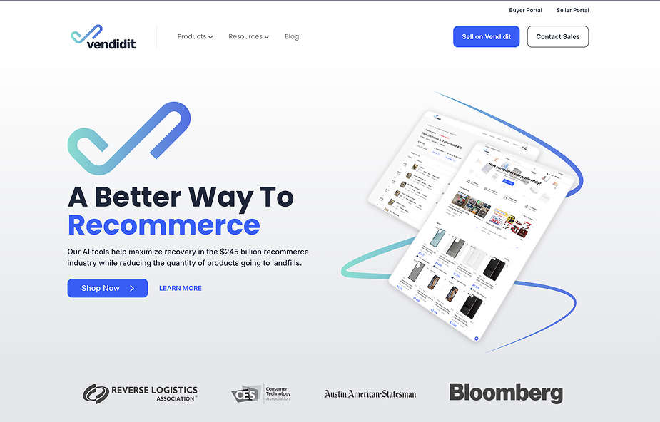
Project Summary
“Creating a system of products relating to their brand.”
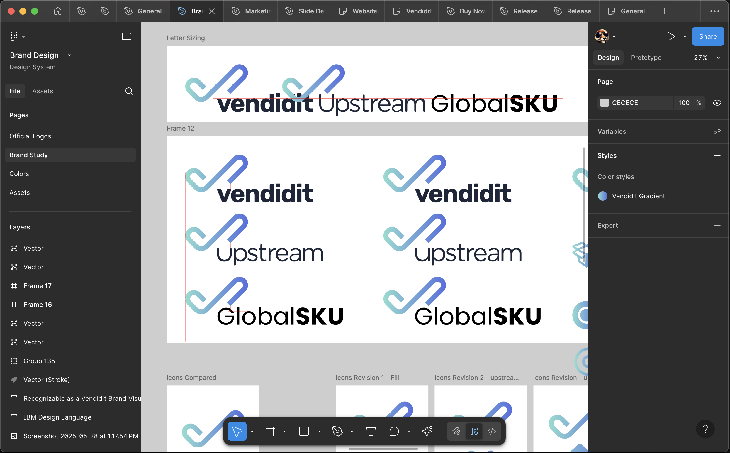
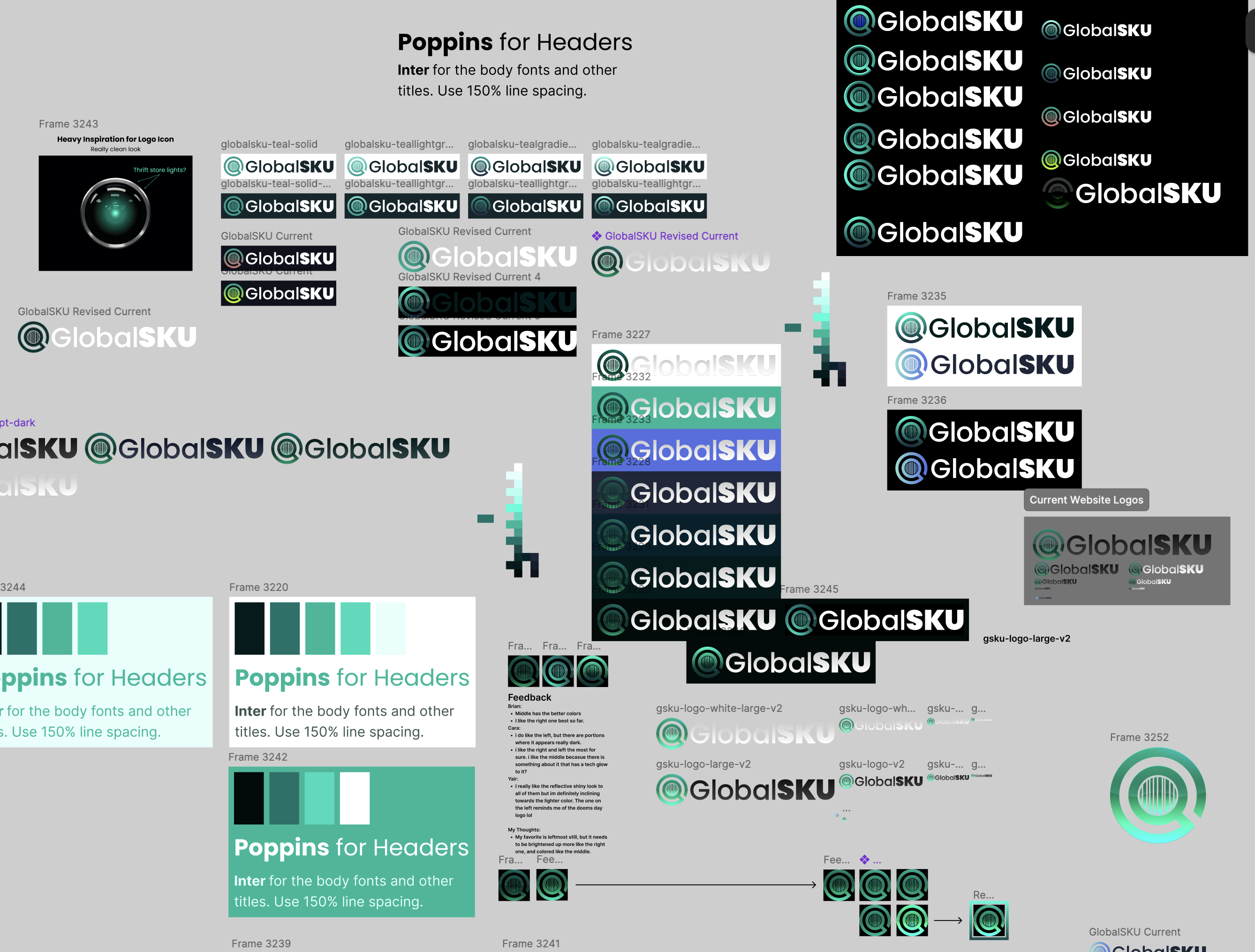
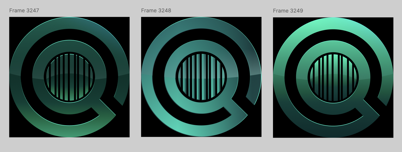
For this project, I was tasked to create the official logos for our two new products: Upstream and GlobalSKU. My assignment was to create two professional logos in 1 week. I felt pressure because I wanted to get these logos perfect and was also working on other assignments during this week.
These logos needed to:
- Represent their product functionality at a glance
- Fit the style of the Vendidit brand
- Be professional looking
- Appeal to stakeholders
I had a lot of fun arriving to the final product. There were many twists and turns, and this document goes over them.
Tools Used
Figma
Assemble logos, apply brand gradients, and finalize layouts.
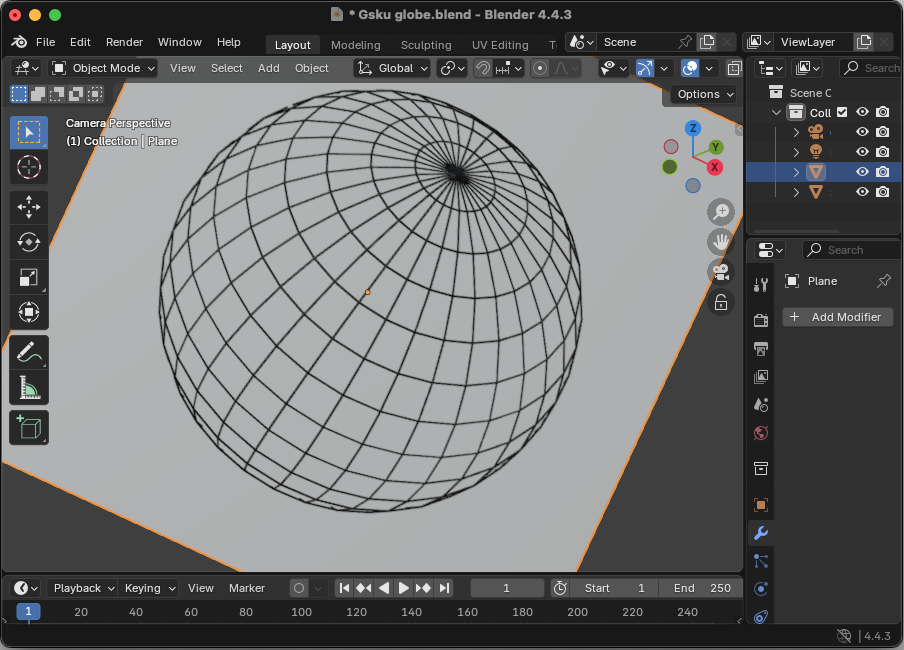
Blender
Create 3D globe wireframe for the GlobalSKU logo.
Illustrator
Image trace the globe render and convert to vector.