Project Summary
“I love foxes, so if I design a brand for myself, it's gonna be related to foxes”
This is a logo and brand design passion project where I design a professional looking tech brand in the theme of my choice.
Foxes are my favorite animal, thinking about them makes me happy, so I went with foxes. Many companies use foxes as their mascot, Mozilla Firefox comes to mind.
Main Goals
- Create a modern looking brand with a fox theme
- Select the brand colors, font, and style
- Design a professional looking logo
I had a lot of fun arriving to the final product. There were many twists and turns, and this document goes over them.
Tools Used
Design the logo, brand colors, and visual identity.
Select typography (Inter, Kanit) for the brand.
Brand Name
One night before bed, I was thinking of names for own brand. I wanted it to be fox related, but couldn’t decide on anything. Suddenly it hit me, “Vulpine Design”. It was so perfect, felt meant to be. I woke up the next day and googled it and of course, another designer used it for their brand. Drats, back to the drawing board.
I decided I could revise the title in the future, so I stuck with Vulpine for now. The more important part of the project was designing a logo and brand theme.
Starting Font
I knew I wanted a sans serif font that had a modern tech feel. I browsed them and couldn’t make a decision. I felt like I need to see the rest before I deciding, so I stuck with Inter for now.

Logo Style
The most iconic fox, vulpes vulpes, was my favorite, so a red-orange spectrum was going to be the ticket. I selected #FF3300 for now and decided to revisit color later.
The most recognizable part of a red fox was its tail, so I decided to make the entire logo based on the tail. I began with the some basic shapes to scope out the direction I wanted to go.

Adding Some Details
After seeing the shapes, I filled in more details to complete the visual. Red foxes have their iconic white tip at the end of their tail, so I experimented with the logo and white tip on a few different shapes.

Brand Colors
It reached the time to decide on some colors. I wanted there to be more than one color on the logo, allowing for some secondary colors to be used in potential ads or landing pages. After lining up serveral shades of red-orange, I stuck with #ED2000 as the primary. It was easy to memorize and a bold color.
I liked the combination of orange, white, and brown; they were fox-like colors. When I attempted to incorporate a desaturated brown into the logo, it stood out way too much. Being a dark color, it drew too much attention. If the logo was going to have additional colors, it needed to be lighter than the primary. I upped the brightness to a peach and light peach color that looked great as a transition from the primary to white.
The brown still looked good, so I repurposed it for accompanying text and darkened it to get the black. The white needed to be bright and clean, so I stuck with #ffffff.

From Full Logo to Icon
After evaluating my concepts, I felt like the tail should be more of an icon accompanied with text. I did want to keep the three semicircle approach to the color change from orange to white. I took the tail logo and converted it into an icon style, created two variations.
Second variation was the winner for me. It had a nice modern looking transition from orange to white. I really liked it, and wanted to call it done, but I decided to experiment with some different colors to see how it looked.

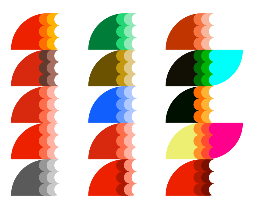
Playing with Colors
Some of them really stuck out to me, especially dark red and multicolor ones like black to orange to white (I used filters to achieve these). I also liked the blue one, but didn’t want to use blue for the brand’s primary color. Playing with the colors was fun, but ultimately it came between the dark red vs the orange. I kept the orange, it popped more as a primary color and did a better job grabbing attention.
Problem #1 - White Background
The logo was complete. It felt perfect and I called it a day. While I was creating export versions, I slapped on a white background and realized what was wrong: you can’t see the tail tip with a white background.

I was so disappointed. I became so attached to the look of the logo and didn’t want to change a thing, but eventually resigned to the fact that a change was needed. Replacing the white was off the table, so my only option was to add an outline around the logo. I began experimenting with different outline styles.
After playing with the outlines, I became accustomed to them and began to favor the thicker variations. I made the thickness intersect with the midpoint of the outer tail semi-circles.

Revisiting the Font
After working with the logo for awhile, it was time for a font revision. Inter wasn’t going to cut it, especially with how the capital “V” looked. I needed something that made a statement. I typed out Vulpine and started browsing google fonts until I came across “Kanit”, which is a thai based font. It checked all the boxes: bold, modern, and sat well with the tail icon.

Finalizing
After applying Kanit to the logo and reducing the font size for a more improved overall shape, I once more played with the reds. The darker reds were really appealed to me this time, but mixed with the outline, it was giving off a look I would use for a clothing brand instead of a software/tech brand. I do love deep red shades but concluded that the orange-red with peach highlights really popped for the brand, making it stand out. Maybe if I turned it into a clothing brand I’d revisit the dark reds.
I liked the look of the logo, despite staring at it for so long. Usually I get sick of what I’m working on after too much exposure, but I kept staring at it with a smile on my face. Now I can’t imagine it without the outline, funny how that works.
After seeing the shapes, I filled in more details to complete the visual. Red foxes have their iconic white tip at the end of their tail, so I experimented with the logo and white tip on a few different shapes.

Problem #2 - Single Color Incompatibility
While again creating variations of the final logo for export, I realized that if I wanted to make the entire logo white, I couldn’t really do that since the design of the inside of the tail would be lost. My first idea was to put outlines between the color changes of the tail. This would destroy the style of the logo, so that was out. I started creating variations of the logo, even going as far as experimenting with a couple completely different designs (which started looking like part of the Adidas logo).
I found a clever solution that preserved the style of the logo: Make the peach and white colors transparent when using a single color. This allowed the icon to be recognizable, and it looked great in single color variations, such as all white.

Final Result
After finalizing all the brand elements: Vulpine was complete. The logo is clean, eye-catching, and represented a fox tail just the way I wanted it to.

Thank you for viewing my project!
Here's some other projects I've worked on: