Project Summary
"GlobalSKU has potential for many types of customers. How do you build a website that communicates to all of them?"
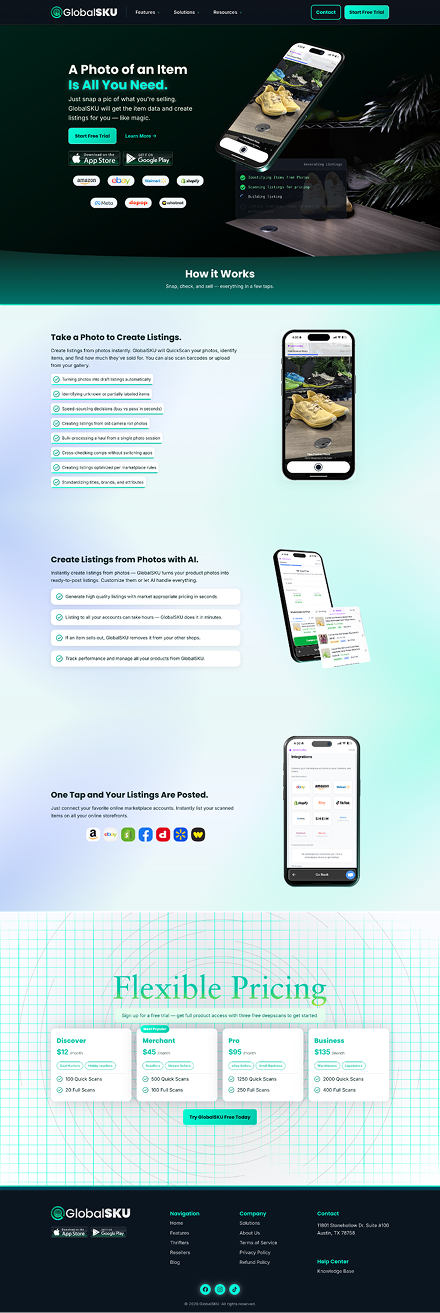
With GlobalSKU's launch being imminent, we needed to turn the GlobalSKU product page into a dedicated website.
While putting together the website, an opportunity presented itself to revitalize the brand and seperate from the Vendidit colors.
Main Goals
- Audience Conversion – Reach the attention of our various audiences and convert them into customers.
- High-Quality Branding – Give GlobalSKU the high-quality treatment it deserves.
- Education – Making the benefits of GlobalSKU clear to potential customers.
Tools Used
For creating the assets and designs of each page.
For building the website.
For the 3D graphics and animations.
For editing the video content.
For removing backgrounds...
UX Plan
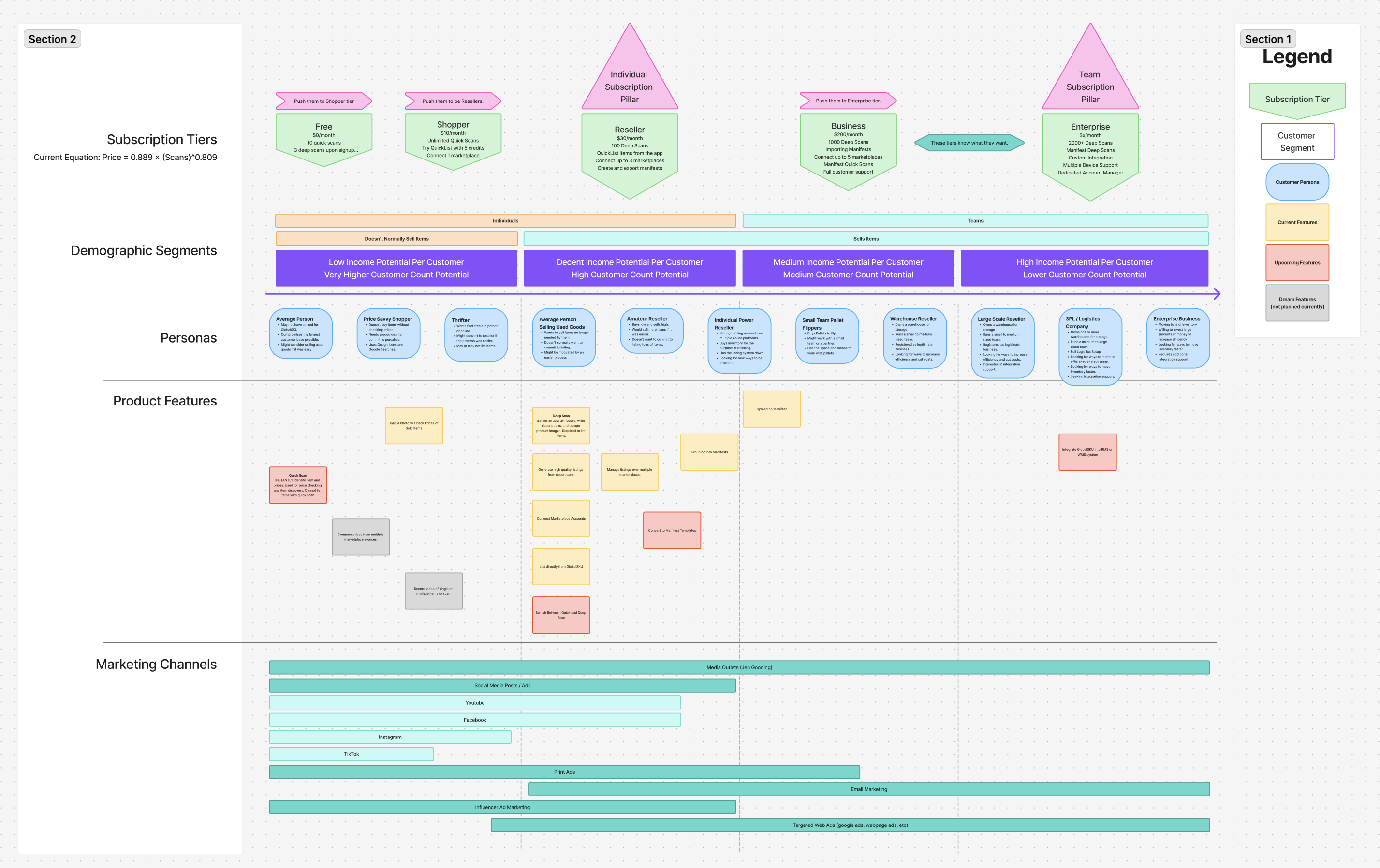
As GlobalSKU approached its release, there were many conversations over who our customers would be. Nobody built a plan and we didn't have enough time to experiment.
I started by listing out all our possible customers and organizing them into a spectrum divided by categories.
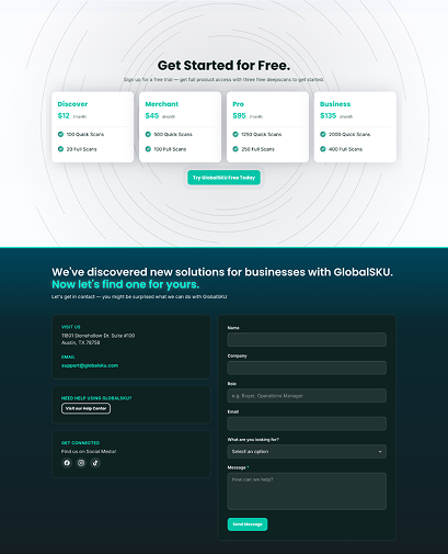
So I decided to build the website page by page, with a dedicated lander for each type of customer. I would then find the results of which page had the lowest bounce rate, highest time on page, and highest conversion rate.
Brand Update
The two-color pastel scheme needed an update. It made making nice ads difficult, and didn't have enough personality to carry the product forward.
From two colors to one
I wanted to pick a color to use for GlobalSKU. Because Vendidit's colors were locked in, and we have two additional products, GlobalSKU and Upstream, I thought, why not take both colors and apply them to each product.
Upstream got the indigo, GlobalSKU got the cyan.
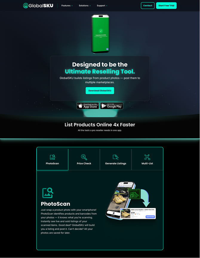
Color Upgrade
When I was designing the product page, I wanted to try a dark theme. I decided to use the cyan mixed with a navy blue to create this spotlight glow effect.
This use of cyan as energy and technology was a great fit for the product. It had good reception from our product team as well. I decided to explore the right shade and saturation combinations and found a system that works well.
Logo Revamp
I'm still pretty proud of the logo, but while using it I noticed contrasting issues on various backgrounds. It's two color left to right gradient didn't seem to serve a realistic purpose.
Given several FAANG+ design changes lately, some evidence supports the idea of us having a rennaissance of gradients (google logo), frutiger aero (liquid glass), skeumorphic kind of designs. I wanted to find something that stood out, so I selected a glassmorphic look that had a nice edge glow and look to it, while still retaining the ability to be one solid color.
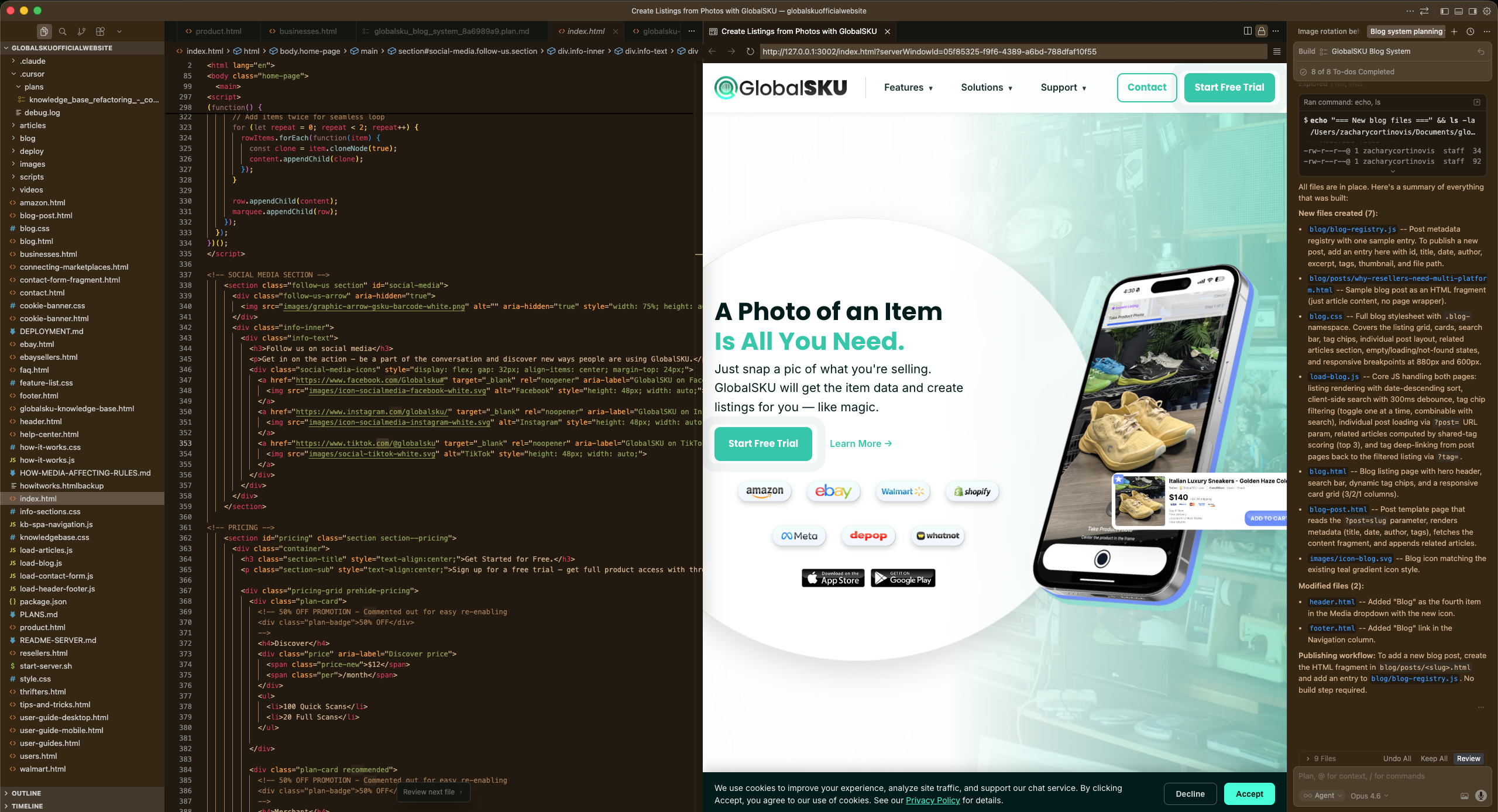
Building with Cursor
The challenges I've found with vibe coding involve finding the best method the achieve a desired look, and building this website was a great vibe coding exercise. The challenges I've found
It's pretty easy to have it build you a website, but not so easy to have it build your vision.
The process that worked best for me, was to have Cursor build the foundation of the website, and once it's set up, I can go in an start prompting/editing code to convert it into my vision.
3D Graphics
When talking about similar products, our bizdev always pointed out the 3D content on their site. I analyzed them and knew I could do better. I was able to get a phone model onto Blender, edit the footag, and learn how to stage and animated it the way I want.
Video Content
I recorded some of the video content myself. I shot this video of my friend scanning her popmart collections one weekend, and edited it on Premiere.
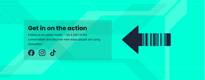
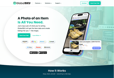
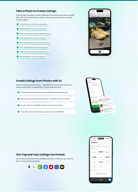
Final Result
The website is live and still being updated, check out the screenshots or see it live at globalsku.com
Thank you for viewing my project!
Here's some other projects I've worked on:
Vendidit Website v2
Designing and building Vendidit's company website for discovery and conversion.
Vulpine Design
Creating a personal brand and logo with a theme based on something I love: Foxes.

Upstream and GlobalSKU Logos
With only one week to design two product logos, quick decisions had to be made.